The Stremio Community has requested a redesign for years. Some of our supporters with an artistic side have even taken upon themselves to attempt this endeavour — we are both humbled and grateful to be amongst such creative and inspiring minds and hearts.
If you want to see some of the community proposals, you can find them at:
– Dribbble
– Behance
– even the top posts of all time on our subreddit are community redesigns
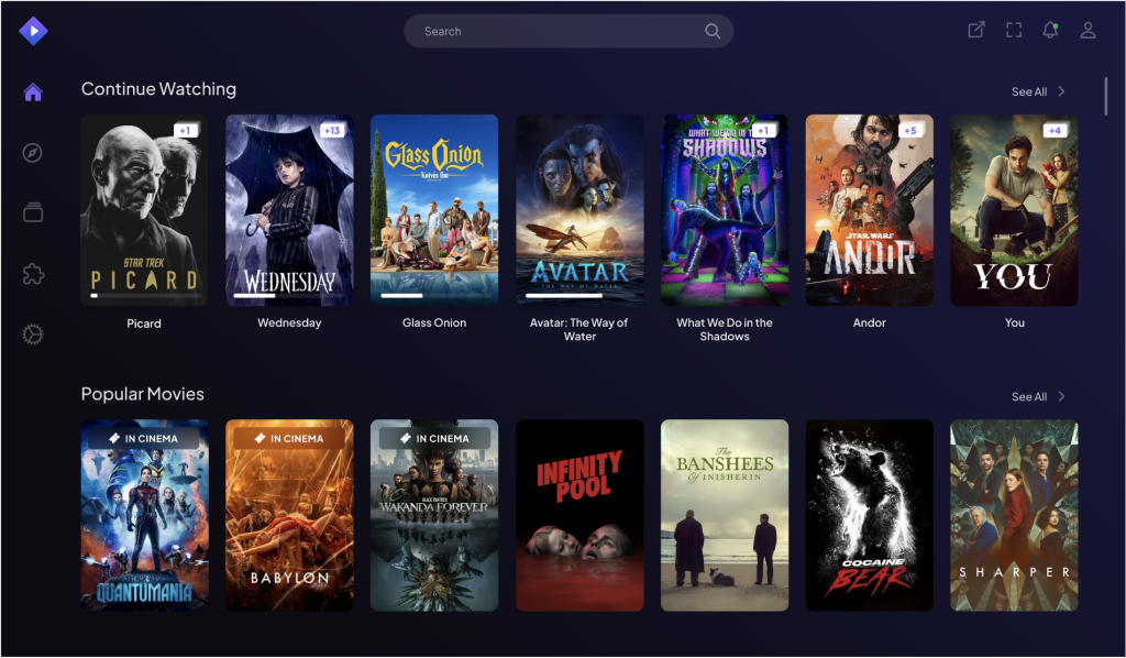
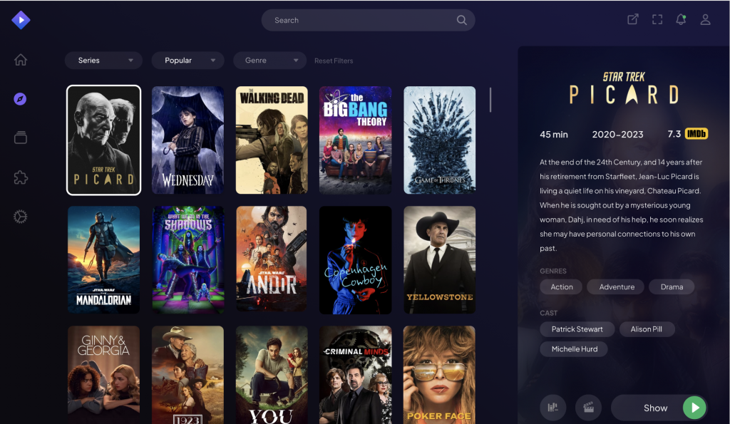
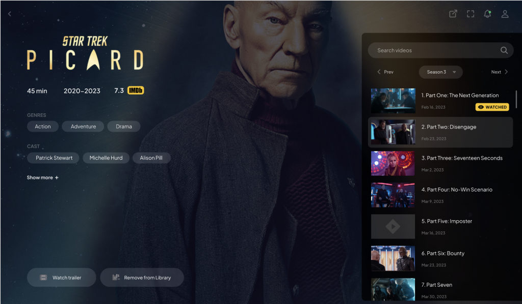
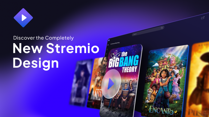
This brand update & app redesign project, however, has been in the works for some time with the Stremio team, and today we’re happy to announce a new, dark & sleek look for your favourite streaming platform:
Updated Logo & Wordmark
Stremur, the Stremio mascot, got a new look!
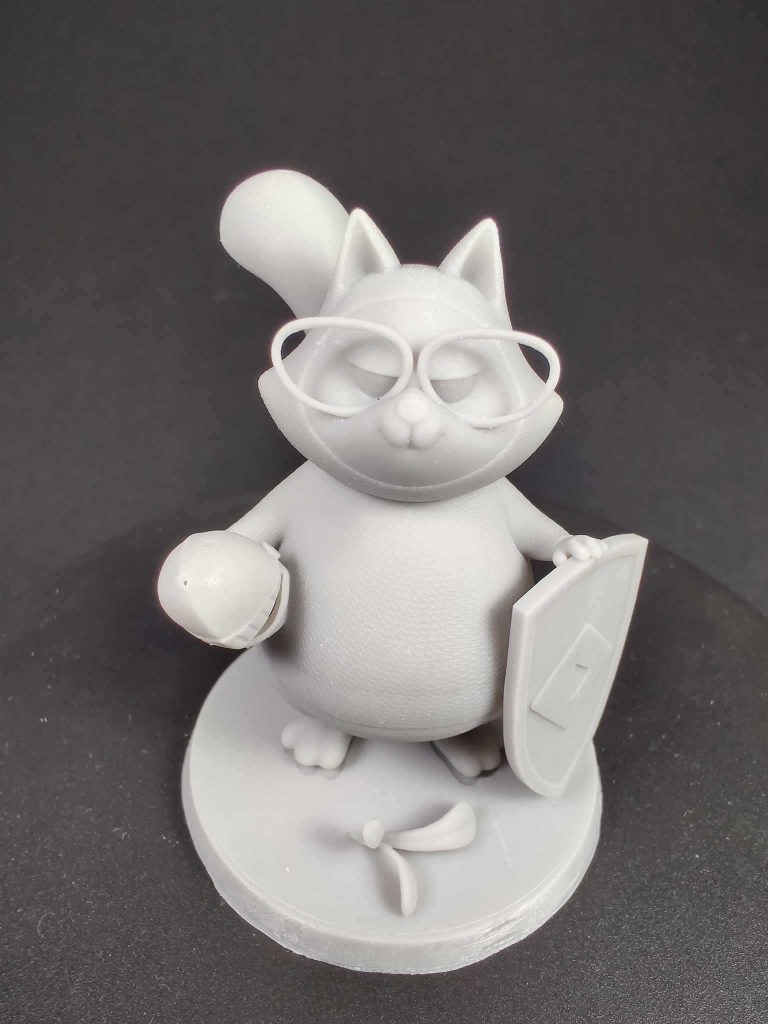
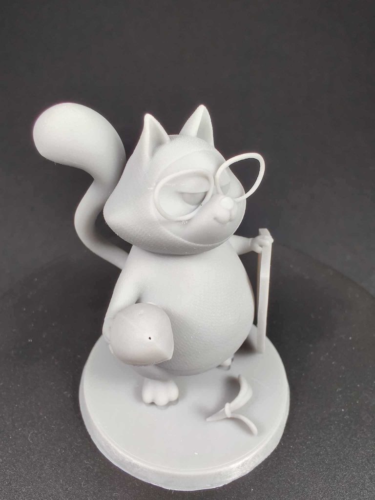
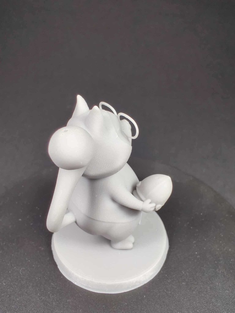
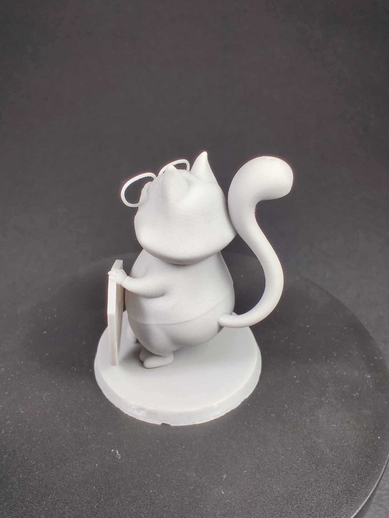
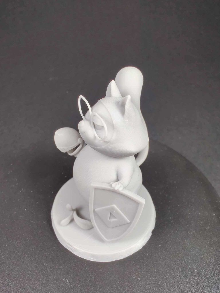
Stremur Knight (3D Model)
With the release of the new 2023 redesign, we are also making the project files for the Stremur Knight 3D model available for free (for personal use only) to the community. You can print it as a tabletop figurine or as a character for board games.
Desktop App
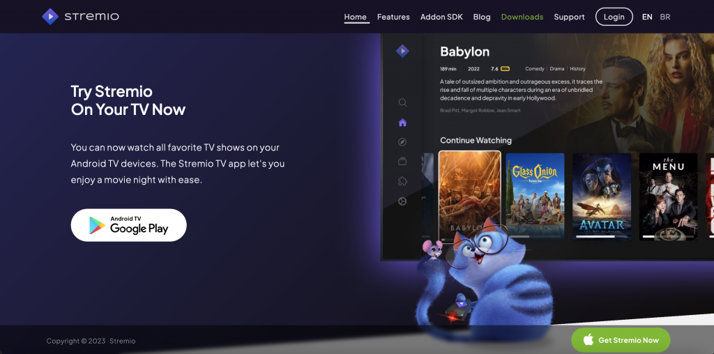
Android TV
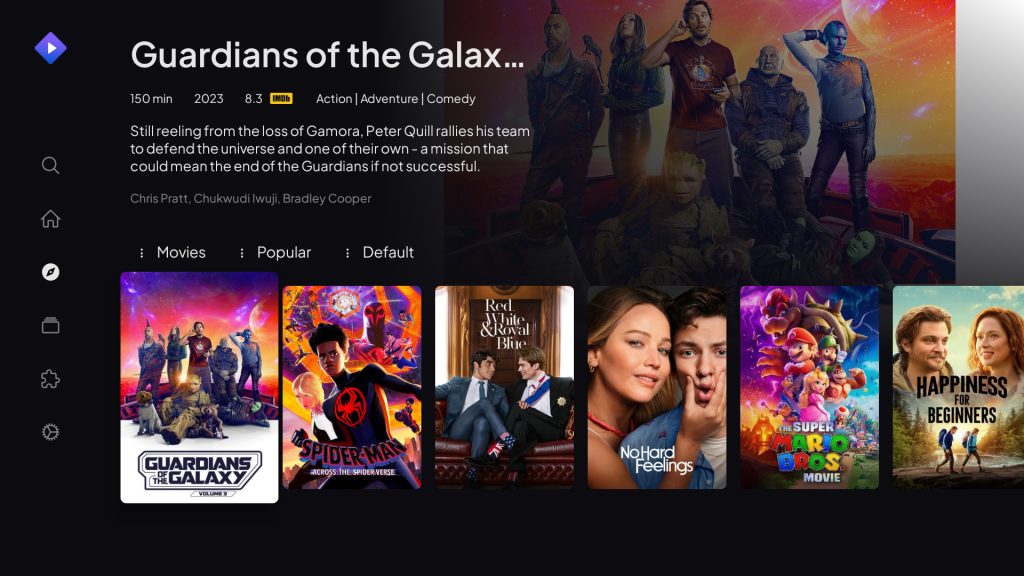
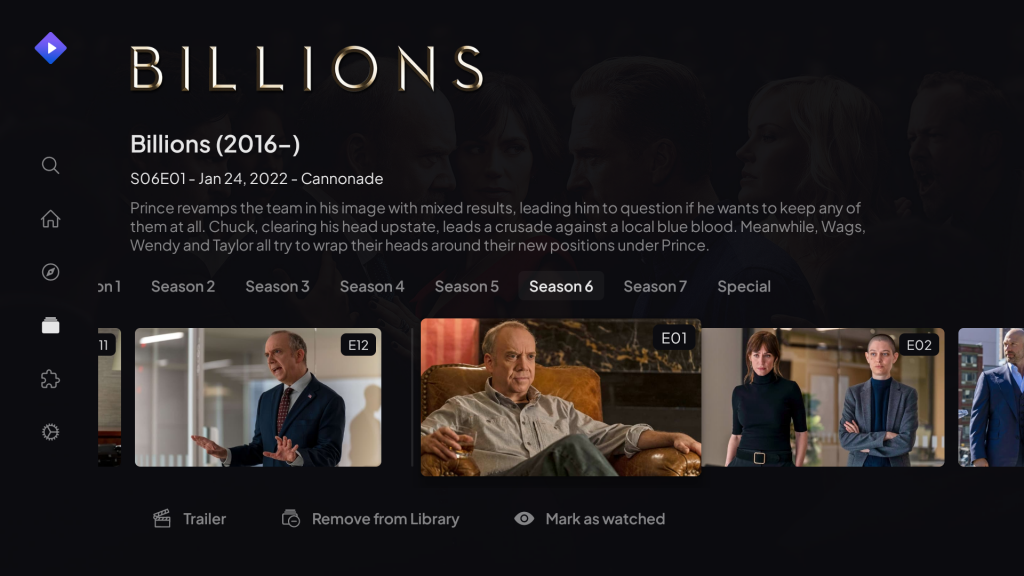
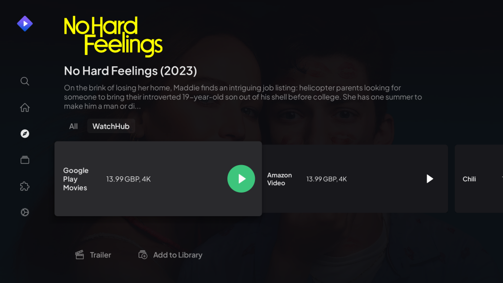
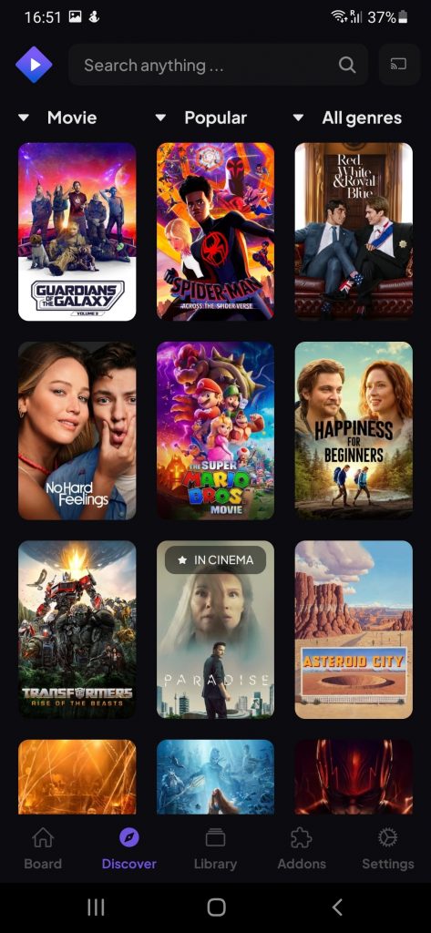
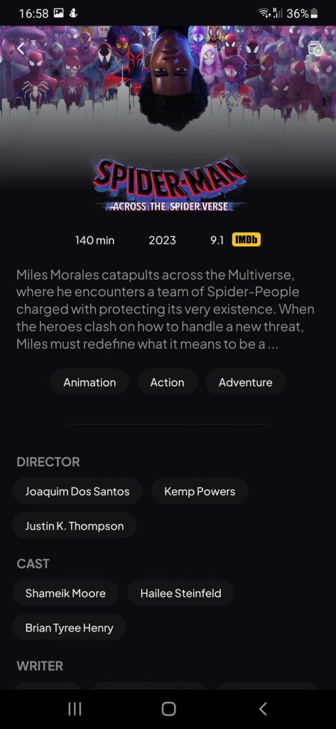
Mobile
Website
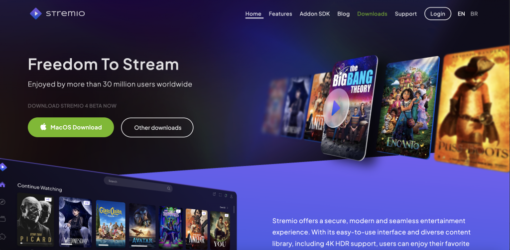
Community Artists
During the redesigning process, our team has also requested the help of many artists from the Stremio community. We would like to thank all those that joined the effort:
– Nilo Alexandre
– Augusto Lopes
– Bruno Palma
– Guilherme Franco
– Rúben Peralta
– Serkan Çamlıca
We would also like to give a big thank you to Maxim Cerevcov, an amazing artist (and 3rd place winner of the 2021 Stremio Art Contest) who worked with us on redesigning the Stremur character!
Lastly, we’d like to thank all of you, the Stremio users, who have always pushed the boundaries of our team, helping us strive to make one of the greatest streaming platforms in the world.
The changes will be applied for all users within 24-48h. The only exception are users that sideloaded Stremio on Android TV devices, which will need to download it from the website and reinstall it manually.
As always, we’re eager to find out what you think about our latest release, so we’re waiting for your thoughts and feedback on our socials.
Because this is a huge update (across all our apps) we urge everyone to report any new bugs by creating an issue here.
If you are on desktop and experiencing a broken user interface due to the update, you should follow these steps to clear your local cache: Windows, MacOS, Linux
Full migration to the new brand may take several weeks, in which time it is expected that the old logo may still be used for the desktop shortcut on Windows, MacOS and Linux.
Stay tuned, we have more surprises for our users in 2023!


My stremio stopped working with this update. I’m unable to scroll through the available movies. This happens on more than one PC.
The blog post was updated with a solution (clearing the local cache, and appropriate links to how to do it) for those that are experiencing a broken user interface after the redesign.
Me too. All live tv seem to be not working
What an amazing UI/UX. Brilliant work. Just lovin it
I can’t scroll down in the new interface, it’s very hard to use it this way
The blog post was updated with a solution (clearing the local cache, and appropriate links to how to do it) for those that are experiencing a broken user interface after the redesign.
Hello,
Many thanks for the redesign
I ve just got the update but the app on my PC seems to have an error, the layout is all messed up. Am I missing any a runtime, all the new 3D redisign is not shown I only see text, I have the latest .NET and All the C++ Runtimes installed do I need something else does the App require any other dependesies.
I am facing issues with the app after the re-desing, things like episodes not loading, the app being harder to navigate through, the redesigned version also does not look like the version advertised on the website. I tried deleting and re-downlaoding the app but it still does not fix the issue. Will these issues be fixed soon or am I the only user facing them?
Where can I find the updates please
Also the web version says the ” stream is not supported” how do I fix that?
its always been like that
What happened with the desktop app for windows? I opened up today and it was a mess the whole interface! I reinstaled the app and still looks weird. Or perhaps it’s just me 🙁 It’s a pity cause it looks great the improvement in the blog pictures.
The blog post was updated with a solution (clearing the local cache, and appropriate links to how to do it) for those that are experiencing a broken user interface after the redesign.
this update doesn’t work on my pc there are no sound only the sound i really really hate what you did with it i love stremio it’s my favourite plateform but now it’s just ruined for me
I can only choose from 2 streaming links
the sound starts but the loading screen remains in front of the video so I can’t use the app at all.
Is there an option to go back to old UI im not liking this new one? If yes how do i do it?
Wtfffff. How can anyone dont like this UI/UX
Lol, wondering if it is react native for mobile…
Always haters gonna hate. Amazing job guys!
You can’t sorry
I don’t have an image and I don’t have subtitles. How and when is it possible to fix that?
I can’t scroll down in the new interface, and I can’t see what I already watched,
The blog post was updated with a solution (clearing the local cache, and appropriate links to how to do it) for those that are experiencing a broken user interface after the redesign.
previous layout there was a play button for resume, but could also click the poster to check the whole season/movie. Now it just resumes, not sure how to do one or the other. Also BEFORE, episodes had a synopsis. Collapsed, but synopsis nonetheless. Would love that back, eventually not collapsed.
I also find that to be problematic.
Commenting here in the hopes that someone from the team reads this.
Where is the “add to library” in the new interface?
Love the new design, great job guys
if you’re having issues, quit stremio from the taskbar hidden icon and clear cache
UI/ UX is awesome but still need some major updates to improve performances & bugs. It is still taking a lot of time to start engine & also takes a lot of time to load stream even though I have great internet connection. And also the logo of Stremio is still not changed in my Windows 11. And please shorten the app name to just “Stremio” from “Stremio – Freedom to Stream”. And also when I stream any video, at the time of playback even though UI/ UX looks great & stylish but on video screen when I open an option panel through right click; it still looks old. Please change that also. And when I play a magnet link, most of the times. It doesn’t start the link/ takes alot of time to start a magnet link even with great quality peers. Finally, why does a movie/ series takes a lot of time/ and is too slow when I download anything through Stremio app (by clicking on download option on video).
Dear Stremio Team, please Improve all these things. Me & my friend’s are so excited. Thanks in advance :).
good job guys!
MINE IS WORKING FINE. LOVED THE UPDATE
How did urs work…streams not loading
Hi team,
Great design but I can’t choose the source torrent anymore. I can’t see the list where it used to be. Is it a common issue or just me ? Has it been moved somewhere else ?
All working great with new UI .
Only few things between this and perfection.
Better library.
Moveable tiles and User created groups.
It would be great if we could create our own groups and subgroups in library , like , horrors , then some subgroups etc..
Stremio is missing some things.
There should be an option in the settings for 0-255 video output, instead of only for 16-235 (full rgb not only limited)
Because we need this setting on the desktop.
1. Stremio’s built-in player cannot reproduce 5.1 sound. Also, it cannot be passthrough for the avr amplifier. They all sound stereo downmix.
The preview images are really small now and difficult to see and read. I can barely make out the faces. Is there a way to make them the size they used to be?
what a wonderful work. thank you all
very pretty , now how can i go back to the old simplified design??
Hi there, i really like the design. However, the discription area used to give episode specific descriptions. Now its just a general description of the show.
Video won’t load since new update
Nice little update. Definitely needs a UI Scaling option… everything feels just a tab bit too small to my eyes. I can’t seem to use ⌘ +/- to change the interface scale
Loved the new UI and haven’t had any unexpected issues so far
I love this update!!
Achei incrível, fiquei bem bonito e moderno!
Só tive um problema: minha tela tem 1360:768 e a página do filme ficou pequena e não dá pra ver o botão de “Add to library”. Será que dá pra colocar alguma opção de zoom da interface?
me encantóooo, muy linda.<3
awesome redesign!
can you make the scrollbar bigger? it is too small
Can we have a way to update or reload the metadata like thumbnail or graphic name? New anime shows early on often doesn’t have that but I can update it when it available.
hi.
the sync fix subtitle vanished.
there is only font size.
After updating Streamion on mobile, I am unable to link it. It asks me to scan a QR Code or go to a website. With what I have to scan this QR Code? By going to the website option, I am unable to connect using the Facebook button, clicking it doesn’t do anything on any browser. Can’t even to log in using Facebook login. Literally clicking it does nothing. I didn’t have to log in on desktop after it received an update, but on mobile now I am unable to do anything.
you downloaded stremio android tv, not stremio mobile, uninstrall it and download the correct app
What needs to be fixed:
– On Windows the desktop logo is still the old one.
– Subtitles not automatically on.
I have to turn on and select my language subtitle manually.
for those who are not able to scroll down through addons you can use arrow keys to scroll through add ons.
love the update, the ui looks really amazing, brought smiles to my face
Very nice work. Well done.
I love the redesign and updates! As both a designer and cat lover, I approve 🙂
I think the update fixed the embedded subtitles turning on even when turned off by default. Thanks a lot for the update and I can’t wait to see what other surprises there are around the corner.
Me encanta como se ve pero,en la version de escritorio,no veo como agregar series o peliculas en la biblioteca. Gracias!
Nice job!
Excellent
this is piece of art
HI GUYS!!
GREAT DESIGN…LOVED IT!!
Great job Stremio team. The ui is way so cool. I am using it on my macbook and the interface is cooler than before. Thanks once aging for this amazing update.
Really impressive work! UI/UX team need a raise, and cred to the devs!
Good design but I can’t use any of the drop down lists (seasons, settings, etc…)
Hi, thanks for the great app! There’s 1 thing that I’d love to see changed though!
Would love to pick a genre first and then apply a filter to it. Right now for example it’s not possible to select horror as a genre and then filter it by year, or popularity. Keep up the great work!
Absolutely loving the new UI design. Had some issues last night after the update but it’s nothing to do with the stremio app. I used both android and android TV apps and works perfectly. Thank you. Keep pushing boundaries. 💪👏
Top ,extra new look,but new version is lagging on android tv and some problem with sound on streams,some kind of error appear,thank you for this best app
How can we update?
I feel the obligation to compliment you guys work! Its pretty clean and sleek. And thanks for provide me some good movies on the go! <3
looks good but why did you remove the subtitles delay feature ?
The desktop app stopped working even though I cleared the cache. I’m sad, but I’m waiting for updates to resolve.
Beautiful
Will there ever be a profiles section on start up? like netflix and disney plus?
loved what u guys did with the ui!!! great work
Nice UI update!!
Hello, when I click through the home screen on a movie I’m in the middle of watching, then it goes straight into continued viewing. And I want to enter the movie menu and not continue from the same point I stopped watching.
Great interface, I would like to see Simkl on stremio same as we have trakt
Great job with the new UI.
Very beautiful, comfortable and functional.
Everything is working fine .
Congratulatons!!!
Total bust. Harder to navigate from TV across the room without the text under the thumbnails. Requires an extra click to go to the season for series. Thumbnails are totally useless for each episode of the series, it just means more scrolling to get to the latest episodes. I don’t want or need glitz, just want to get to the program I want to watch as quickly as possible. I doubt this will make it to the comments on the website.
“Continue Watching” used to have a play button, but if you clicked the poster it brought up the series. This no longer functions and I have to ‘discover it’ and ‘add to my library’ now for ALL of the shows on the ‘continue watching’ list. It’s super annoying.
I suggest putting more efforts in new Add-ins (such as for new streaming sites) instead.
The continuing of this app is hang on those add-ins, and ONLY on them.
Non-official add-ons are created by the community
You can propose your ideas in the Stremio Addons community on reddit or discord
This is amazing! I LOVE YOU STREMIO!!! Big shoutout to the community & team that made this happen.
Is Stremio ever hoing to come to LG Web Os anytime soon
Please fix the issues in continue watching. I cannot see the episode list of series in continue watching also cannot change stream source for movies in continue watching. And the ui is so buggy very hard to navigate especially if you are watching a movie
Hi! There are no movie titles/names under the movie posters except in the home screen.
When will we be getting stremio for Samsung Tizen TV.
Thanks
I just updated my TV app, but it’s still the same. No change whatsoever on the interface.
Nice! Still can’t go to next episode on Android quickly, as scrubbing to the end just goes straight back for some reason, and there isn’t a next episode button either. Also, how about a setting for changing the seek time to 10s instead of 15s like on YouTube and all other video players? Double tap to seek instead of the buttons would be nice too
when will the app be available on IOS. I know about the non torrent streaming version but I loved it when it was on android to work properly. I hope to see it function similarly in IOS soon.
WTH happened!?!?! the menu is unusable now , can’t find the search field and the movie detail page is completely broken! how can I change it back ? it happened without my consent and I don’t know how to fix it
The volume is not going above 100% (red bar) anymore when using the mouse scroll. =(
I would much prefer the volume bar on the right. And it would be so much better if, when I scroll the mouse wheel, it wouldn’t show me the progress bar—I really dislike getting a spoiler about whether the movie is already at the end or not.
Unfortunately after updating stremio it stopped working, movies and series just don’t load.
Guys, great job. Can’t really complain as it’s free, and entertaining. I would point out that some addons, particularily IMBD are asking us to go to a third party on the www and subscribe, and other addons such as piratebay are missing. I’ve tinkered a bit, and it’s at a standard I’m happy with but my torrent choices are a bit limited. Addon fix is probably something you might look at.
I alsowent to version 4.4.142 to gt things really buzzin, with new design.
Aside from that, nice.
If any addon chooses to monetize their content, this is their choice, it is not against the addon catalog guidelines. The IMDB addon works without a subscription too, I believe, the subscription to RPDB only adds ratings on the posters.
For community built addon discussions, you can try asking at https://reddit.com/r/StremioAddons
The addon i use is called torrentio, its perfect i recommend it
O watch hub não ficou dinamico, se tiver uma lista muito grande fica dificil a rolagem. Em lista estava muito melhor.
You did an amazing job with this new update!
Thank You. 🙂
No longer able to cast my TV using Chromecast after the update. TV does not show up in the streamio windows apps or mobile app anymore.
Same with me. :-/
Linux ubuntu Arm64 also broke.
Home page is good but my library and discover are terrible.
Mostly is just a terrible layout and old purple was better.
Would be nice to be able to keep the old design or load different skins designs.
I believe we should leave it alone when is good and so many people happy.
Dejen de llorar, la pagina no es de ustedes……..Si no les gusta, salganse…
I cant choose the chapters of the series. Only chances ive got are choosing the series and moving to the next chapter,
No stream available for any series, movie or anime
Update dont work at all
Some older movies, four years old or more, can no longer be seen.
Isn’t it possible to fix this problem?
Thank you. The new version of Stremio is amazing.
Congratulations
Can’t scroll to see the whole summary and adding them to the library.
Overall love the new design
Love the new look, but the calendar doesn’t seem as responsive as it used to be. When you click on a date, it doesn’t automatically scroll to the content available on that date on the right hand side panel.
Also I think the date is wrong. Pretty sure today is Monday 28th August 2023, not Monday 29th August.
I don’t know if that’s just an issues on M1 mac desktop version?
Other than that, love the design !
Hi it looks really good, I just think the switch between Movie and Series should not be a drop-down ; and there was a way to mark an entire series as watched. Keep up the good work 🙂
Congratulations to the whole team evolved in the new stremio. I am very thankful . You guys are amazing, no words to descrbe
Ooooh I’m so happy Stremio finally got a redesign! My app updated midway through watching a movie, but it was a great surprise. Particularly love the new logo 🙂
The new interface is really Good, but i want to suggest, in future releases for windows, please, consider create an option to reduce more the windows sizes and too an option to “picture in picture” as some apps have it and very good, if you need to do another tasks while watch an movie or serie …. Thanks for all effort in these updates !
UI has become super laggy. Takes an age to even load the synopsis and cover art. The overall design looks good but it’s just so slow to respond. Once in the show/movie, all is good at this point in time
Love the change, but will there ever be an option to hide the IMDB score? It can totally squander my expectations for a film before watching it. Please, please, please. I’d do anything for the option to remove it. Thank you.
You are the best!!
eskiden yarıda bıraktığım filmi hangi kaynaktan izlediğimi görebiliyordum. eski altyazı fontu harikaydı. yenisinde okumak çok yorucu oluyor. dostum, bazen işleyen düzen bu kadar sert değiştirilmemeli. yeniliğe karşı değilim. ama bu kadar kökten değişiklik yorucu olabiliyor. basit olan zordur. daha yeni butonlar daha iyisi demek değildir.
I could see from which source I watched the movie that I had left unfinished in the past. the old subtitle font was great. Reading in a new one is very tiring. man, sometimes the working order shouldn’t be changed so drastically. I am not against innovation. But such drastic change can be tiring. simple is difficult. Newer buttons don’t necessarily mean better.
i’m having problems with the pc app when pausing or whenever i use the arrows to forward the app becomes irresponsive and laggy
A heavy update I’d say. Nevertheless, the UI looks more vibrant and engaging, seems a bit confusing at first, but we’ll get used to it. Thanks for your efforts team! Really grateful to you for continuously delivering 🙂
I totally love the new update. The UI is perfect and it really looks refreshing and easy to use, but on top of all it is aesthetic. Totally obsessed, however when I search it on my computer it still has the old logo. It is not a problem but I thought it changed too and so I uninstalled and reinstalled the app but it didn’t change. Will it change in the future?
Nice update, guys. It would be great to add an alternative way to display the movie thumbnails, switching from the current horizontal one (as it is in Netflix for example) to a vertical one (like in Popcorn Time). This would also maximize the number of thumbnails visible at once on the screen.
“The application is not functioning properly. A black screen appears while watching movies, and it closes by itself. This happened after the update. There were no issues with version 4.4 159.”
Love it, looks great. Thanks for all your hard work.
The new UI looks great, but there are a few flaws…
1) The app become very unrespondsive both on Andriod OS’ and on Google TV
2) There is no share icon where I can share a movie page to a friend. This is actaully missing, but was availavble on the older version
3) The subtitles for most movies are way out of sync
I just noticed the upgrade and went online to see if there was anything, so I landed here. I really appreciated the improvements, both in terms of branding and UX/UI. You’re doing a great job guys and in the last period you’ve brought so many new things. Keep it up! 💪🏻
Looks awesome! 👀
the new update looks clean , but can we have the digital audio passthrough for android tv version like mobile version ?
I have this problem when videos/movies have too much genres/tags assigned
https://freeimage.host/i/HyQ7JbR
honestly both the UI and brand update are infinitely better than the ones posted on reddit.
well done guys we love you
im must be getting old, i dont like change. i liked the old design
The new UI looks great.
It is very beautiful.
EU amei essa nova atulização pra mim esta tudo perfeito!
is there a way to remove the “Adult” category? I’m not very exited having this there with children using the system
Hi! my name is Maribel and Im a graphic designer (Argentina). I would like to participate in the Stremio design. How can I get in touch with the team?
Beautiful
Eu adorei o novo design, deixou o app com uma cara mais séria e “limpa” – parecendo um streaming pago mesmo. Muito grata pelos desenvolvedores que pensaram nesses detalhes. AMÉM PIRATARIA!
I love the new UI
Tunneled playback problem on android tv app with sound,anyone else?thank you
Stremio is godsent to this world.
Only one small request – Can’t scroll down for the movie info ! hope you can look into this tiny glitch.
Kipidup Stremio !!!
Thank you guys! Amazing new look&feel
Please put calendar on Android version.
looks great and love the enthusiasm; great work everyone
Awesome job!
It’s an incredible job
Great update and great work, keep it up stremio team !!
Ficou muito top já uso á muito tempo melhor que Netflix e geral
Since installing the latest update;
1.The stated cache location on C:/ does NOT cache anything
2.When I raise the cache size to 10 gb after shutdown it reverts to 2gb
3. When I assign a different drive for cache after shutdown it reverts to C:/
nao gostei, adorei
I just want Stremio on iOS please 🙁
I love the new design, it looks very professional, great job!
This is the best app that you can stream what you want at any time and place. I wish it had some kind of recording feature.